
Excel can recommend charts for you. The chart it recommends depends on how you arrange the data in your worksheet. You might also have a specific chart in mind. How you arrange your data determines which chart types you can use.
How to arrange your data
| For this chart | Arrange the data |
|---|---|
| Column, bar, line, area, surface, or radar chart | In columns or rows, like this: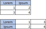
|
| Pie chart This chart uses one set of values (called a data series). |
In one column or row, and one column or row of labels, like this: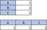
|
| Doughnut chart This chart can use one or more data series |
In multiple columns or rows of data, and one column or row of labels, like this: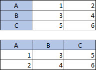
|
| XY (scatter) or bubble chart | In columns, placing your x values in the first column and your y values and bubble sizes in the next two columns, like this: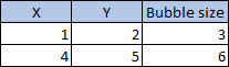
|
| Stock chart | In columns or rows, using a combination of volume, opening, high, low, and closing values, with names or dates as labels in the correct order, like this: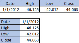
|
Tips for arranging data for charts
Here are some suggestions for what to do if your data doesn't match the suggested organization.
Select specific cells, columns, or rows for your data. For example, if your data has multiple columns but you want a pie chart, select the column containing your labels, and just one column of data.
Switch the rows and columns in the chart after you create it.
- Select the chart.
- On the Chart Design tab, select Select Data.
- Select Switch Row/Column.
Transpose your source data between the X and Y axis and paste the transposed data in a new location. Then you can use the transposed data to create your chart.
- Select your data.
- On the Home tab, select Copy
 .
. - Click where you want the new transposed data to be.
- Press CONTROL + OPTION + V.
- Select Transpose, and then click OK.