

A Pareto or sorted histogram chart contains both columns sorted in descending order and a line representing the cumulative total percentage. Pareto charts highlight the biggest factors in a data set, and they're considered one of the seven basic tools of quality control as it's easy to see the most common problems or issues.
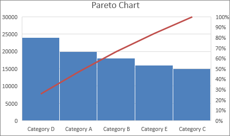
Create a Pareto chart
Select your data. Typically, you select a column containing text (categories) and one of numbers. A Pareto chart then groups the same categories and sums the corresponding numbers.
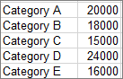
If you select two columns of numbers, rather than one of numbers and one of corresponding text categories, Excel charts your data in bins, just like a histogram. You can then configure bins.
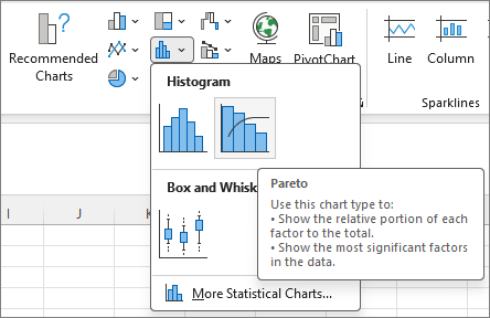
Select Insert > Insert Statistic Chart, and then under Histogram, pick Pareto.
Tip
Use the Chart Design and Format tabs to customize the look of your chart. If you don't see these tabs, click anywhere in the Pareto chart to add the Chart Tools to the ribbon.
Configure bins
Right-click the chart horizontal axis, and then select Format Axis > Axis Options.
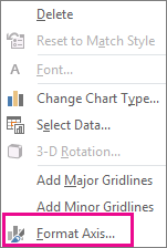
Use the following information to pick the options you want in the Format Axis task pane.
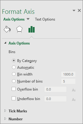
By Category The default when both data and text are plotted. The text categories are plotted on the horizontal axis and graphed in descending order.
Tip
To count the number of appearances for text strings, add a column and fill it with the value "1". Then, plot the Pareto chart and set the bins to By Category.
Automatic This is the default for Pareto charts plotted with a single column of data.
Bin width Enter a positive decimal number for the number of data points in each range.
Number of bins Enter the number of bins for the Pareto chart (including the overflow and underflow bins). The bin width adjusts automatically.
Overflow bin Select the box to create a bin for all values above the number in the corresponding box. To change this value, enter a decimal number into the box.
Underflow bin Select the box to create a bin for all values below or equal to the number in the corresponding box. To change this value, enter a decimal number into the box.
 (the Statistical chart icon). In the Histogram section, click Pareto.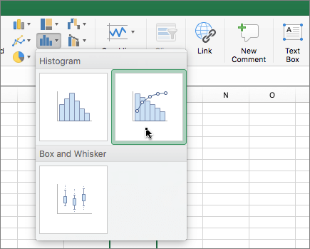
See also
Create a box and whisker chart