Use the List and other Web Parts on classic pages
Applies To
SharePoint Server 2013 Enterprise SharePoint in Microsoft 365 SharePoint Foundation 2013When you create a new site from a site template, Web Parts are automatically added to the site home page. For example, a team site includes Announcements, Calendar, and Links Web Parts. These Web Parts are instances of the List Web Part that use a preconfigured list template to display list data.
Similarly, when you create a list or library on your site, a Web Part of the same name as the list or library is automatically created. For example, if you create a list called Contracts, a Web Part called Contracts will be available in Site contents. The Web Part automatically displays the data contained in the list or library that you created.
After you add a list or library Web Part to a Web Part Page, you can customize the view to show only the information that you want to display on the page. You edit the current view from the Web Part Page.
You can also create custom views of a list or library, which you can use to display different sets of information in different instances of the Web Part for that list or library. You create custom views of a list or library by using the View menu on the list or library that you want to customize.
-
In the Quick Launch bar or on the page, click the Listtitle that you want to customize, and then click the List tab on the ribbon.
-
If the view you want to customize is showing, click Modify View in the ribbon. If it's not showing select the view you want under Current view, and then click Modify View.
-
In the Columns section, you can show or hide columns by selecting the appropriate check boxes. Next to the column name, enter the number for the order of your column in the view.
-
In the Sort section, choose whether and how you want the information to be sorted. You can use two columns for the sort, such as first by author, and then by file name for each author.
-
In the Filter section, choose whether and how you want to filter the information. A filtered view shows you a smaller selection, such as items created by a specific department or with an Approved status.
-
In the Tabular View, choose whether you want a checkbox on each row or not so you can make multiple selections in the list.
-
In the Group By section, you can group items with the same value in their own section, such as an expandable section for documents by a specific author.
-
In the Totals section, you can count the number of items in a column, such as the total number of issues. In some cases, you can summarize or distill additional information, such as averages.
-
In the Style section, select the style that you want for the view, such as a shaded list in which every other row is shaded.
-
Under Folders, you can choose Show items inside folders to support folders in the your list or library, or Show all items without folders to show everything at the same level.
-
For theItem Limit section, you can limit how many files are viewed on a page, and whether they're shown in subsequent batches, or just that number items.
-
If you plan to view the list or library on a mobile device, select the options that you want in the Mobile section.
-
Click OK.
You can connect a Library or List Web Part to another Web Part, provide data to it, and change the way the data is displayed in the other Web Part, including another List Web Part.
-
On the Settings menu
-
If necessary, add the other Web Parts to the page that you want to connect to.
-
Locate the List Web Part on the page or add the List Web Part to the page.
-
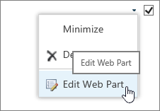
Click the Web Part menu
-
Point to one of the following commands, and then click the name of the Web Part to which you want to link:
|
Command |
Description |
|
Provide Row To |
You can connect one Web Part to another Web Part by passing a selected row of data to the other Web Part. Depending on how the other Web Part was created and gets the data, the other Web Part might display the row data or use the row data as a filter or parameter value. In standard view, a Select Item column containing option buttons is automatically added when you connect the Web Part, so that you can indicate which row to pass to the other Web Part. You can select only one row at a time in standard view. Some columns, such as the Edit column, are not available for use in a Web Part connection. In datasheet view, you can select multiple rows, but only one row is passed to the other Web Part. If multiple rows are selected, the row containing the active cell is passed to the other Web Part, and all other rows are ignored. You cannot provide data in the Total row or New row to the other Web Part. With this type of connection, you can have more than one Web Part connected to the Web Part. |
|
Provide Data To |
You can connect a Web Part to another Web Part that works with list data. In this case, the first Web Part is the data source for the second Web Part. In standard and datasheet view, only the data in the view is provided to the other Web Part. With this type of connection, you can have more than one Web Part connected to the Web Part. |
|
Get Sort/Filter From |
In standard and datasheet view, you can connect the Web Part to another Web Part that can provide the following information to it:
With this type of connection, only one other Web Part can be connected to the Web Part. |
All the Web Parts on your site are usually available in Site contents. When you first add a list or library Web Part from Site contents to a Page, the Web Part Page displays the default list view. To display the data that you want in the List Web Part as well as the other connected Web Part, you may need to edit the view of the list. For example, you may want to filter, sort, or group data a different way or display different columns.
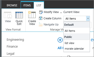
You can change the list view from the custom properties Manage Views section of the tool pane in one of two ways:
-
Select a different view from the Current View property.
-
Click Modify View to edit the current view.
Whenever you select or edit a list view, a copy of the list design is made from the original site list design and saved with the Web Part. However, the list data remains the same.
Be careful when you switch to a different view from the current view. You may delete changes that you made to the current view and may disable Web Part connections that depend on columns in the current view. You are prompted for confirmation if you switch views
Although you can display all list types in a List Web Part, only certain list types are supported when you make a Web Part connection. In general, list types that display data in tabular format, such as Contacts, are supported. Lists that display data in a nontabular format, such as folder view, are not supported. The supported and unsupported list types are listed below.
|
Supported list types |
Unsupported list types |
|
|
Although you can display all list column types in a List Web Part, only certain list column types are supported when you make a Web Part connection. The supported and unsupported list column types are listed below.
|
Supported list column types |
Unsupported list column types |
|
|
All Web Parts share a common set of properties that control their appearance, layout, advanced, Ajax options, and miscellaneous characteristics.
Note: The common Web Part properties that you see in the tool pane may be different from what is documented in this section for several reasons:
-
To see the Advanced section in the tool pane, you must have appropriate permission.
-
For a specific Web Part, a Web Part developer may have chosen not to display one or more of these common properties or may have chosen to create and display additional properties that are not listed below in the Appearance, Layout, and Advanced sections of the tool pane.
Edit Web Part properties
-
Click Settings and then click Edit Page.
-
On the Web Part you want to edit, click the Web Part Edit menu
|
Property |
Description |
|
Title |
Specifies the title of the Web Part that appears in the Web Part title bar. |
|
Height |
Specifies the height of the Web Part. |
|
Width |
Specifies the width of the Web Part. |
|
Chrome State |
Specifies whether the entire Web Part appears on the page when a user opens the Web Part Page. By default, the chrome state is set to Normal and the entire Web Part appears. Only the title bar appears when the state is set to Minimized. |
|
Chrome Type |
Specifies whether the title bar and border of the Web Part frame are displayed. |
|
Title |
Specifies the title of the Web Part that appears in the Web Part title bar. |
|
Height |
Specifies the height of the Web Part. |
|
Width |
Specifies the width of the Web Part. |
|
Property |
Description |
|
Hidden |
Specifies whether the Web Part is visible when a user opens the Web Part Page. If the check box is selected, the Web Part is visible only when you are designing the page and has the suffix (Hidden) appended to the title. You can hide a Web Part if you want to use it to provide data to another Web Part through a Web Part connection, but you don't want to display the Web Part. |
|
Direction |
Specifies the direction of the text in the Web Part content. For example, Arabic is a right-to-left language; English and most other European languages are left-to-right languages. This setting may not be available for all types of Web Parts. |
|
Zone |
Specifies the zone on the Web Part Page where the Web Part is located. Note: Zones on the Web Part Page are not listed in the list box when you do not have permission to modify the zone. |
|
Zone Index |
Specifies the position of the Web Part in a zone when the zone contains more than one Web Part. To specify the order, type a positive integer in the text box. If the Web Parts in the zone are ordered from top to bottom, a value of 1 means that the Web Part appears at the top of the zone. If the Web Parts in the zone are ordered from left to right, a value of 1 means that the Web Part appears on the left of the zone. For example, when you add a Web Part to an empty zone that is ordered from top to bottom, the Zone Index is 0. When you add a second Web Part to the bottom of the zone, its Zone Index is 1. To move the second Web Part to the top of the zone, type 0, and then type 1 for the first Web Part. Note: Each Web Part in the zone must have a unique Zone Index value. Therefore, changing the Zone Index value for the current Web Part can also change the Zone Index value for other Web Parts in the zone. |
|
Property |
Description |
|
Allow Minimize |
Specifies whether the Web Part can be minimized. |
|
Allow Close |
Specifies whether the Web Part can be removed from the Web Part Page. |
|
Allow Hide |
Specifies whether the Web Part can be hidden. |
|
Allow Zone Change |
Specifies whether the Web Part can be moved to a different zone. |
|
Allow Connections |
Specifies whether the Web Part can participate in connections with other Web Parts. |
|
Allow Editing in Personal View |
Specifies whether the Web Part properties can be modified in a personal view. |
|
Export Mode |
Specifies the level of data that is permitted to be exported for this Web Part. Depending on your configuration, this setting may not be available. |
|
Title URL |
Specifies the URL of a file containing additional information about the Web Part. The file is displayed in a separate browser window when you click the Web Part title. |
|
Description |
Specifies the ScreenTip that appears when you rest the mouse pointer on the Web Part title or Web Part icon. The value of this property is used when you search for Web Parts by using the Search command on the Find Web Parts menu of the tool pane in the following Web Part galleries: Site, Virtual Server, and Web Part Page. |
|
Help URL |
Specifies the location of a file containing Help information about the Web Part. The Help information is displayed in a separate browser window when you click the Help command on the Web Part menu. |
|
Help Mode |
Specifies how a browser will display Help content for a Web Part. Select one of the following:
Note: Even though custom Microsoft ASP.NET Web Parts support this property, default Help topics open only in a separate browser window. |
|
Catalog Icon Image URL |
Specifies the location of a file containing an image to be used as the Web Part icon in the Web Part List. The image size must be 16 by 16 pixels. |
|
Title Icon Image URL |
Specifies the location of a file containing an image to be used in the Web Part title bar. The image size must be 16 by 16 pixels. |
|
Import Error Message |
Specifies a message that appears if there is a problem importing the Web Part. |
|
Property |
Description |
|
Enable Asynchronous Load |
Select or clear this check box to load the data asynchronously (You can continue working before all the data loads) or synchronously (The List view displays a "loading" image until the all the data is returned from the server. |
|
Enable Asynchronous Update |
Select or clear this check box to enable or disable asynchronous or synchronous behavior for the following operations: sorting, paging, filtering, and refresh. |
|
Show Manual Refresh Button |
Select or clear this check box to display or hide a button to manually refresh the List view. |
|
Enable Asynchronous Automatic Refresh |
Select or clear this check box to enable or disable automatically refreshing the List view. |
|
Automatic Refreshing Interval (seconds) |
Specify the time interval between each automatic refresh operation. The default value is 60 seconds. |
|
Property |
Description |
|
Sample Data |
Enter sample data as a valid XML file and with the same structure as the data returned by the data source. A SharePoint compatible editor, such as Microsoft SharePoint Designer 2013, can use the sample XML data specified by this property to render the Data View at design time. |
|
XSL Link |
Use to enter XSLT source code into a plain text editor. Knowledge of XSLT syntax is required to use this editor. |
|
Enable Data View Caching |
Select or clear this check box to cache or not cache the XSL transform as well as the Data Source Control instance. |
|
Data View Caching Time-out (seconds) |
Specifies the duration in seconds for clearing the cache. Selecting 0 sets this property to the default value of 86,400 seconds (which is one day). |
|
Send first row to connected Web Parts when page loads |
Select or clear this check box to send or not send the first row of data to one or more connected Web Parts when the page loads. |
|
Server Render |
Select to disable client-side rendering of the Data View Web Part. This also hides the Disable view selector menu, Disable "Save This View" button, and Display Search Box properties. |
|
Disable view selector menu |
Show or hide the View Selector menu … above the list column headers. |
|
Disable 'Save This View' button |
Show or hide the Save This View button above the list column headers. By default, this button appears when you change the current view by filtering or sorting it. |
|
Display Search Box |
Show or hide the list or library Search box above the list column headers. |
|
JS Link |
Enter the URL of a JavaScript file that renders the Data View Web Part. Knowledge of JavaScript is required to use this property. |


